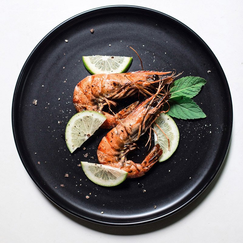
Stop Making Me Peel Shrimp
Allow me to upset every restaurant chef in the world with the following statement: Stop making me peel shrimp from their shells in your restaurant.
My fingers get greasy. My napkin is rendered useless within minutes. You didn’t supply me with a wet wipe. I’ve inadvertently bitten off and nearly swallowed a piece of shell. My finger is bleeding from being poked with a spiky shrimp head.
Is this really the experience you want your patrons to have? Why not offer a dish that’s easy to eat and doesn’t leave my hands filthy and bleeding when you drop off the dessert menu?
Chefs will say it’s all about presentation and flavor. But to me it signifies laziness. Why stop at leaving the shells on? Why not leave the fins on my fish? A bone in my hamburger? The hard end on my zucchini? The stem on the red bell pepper? Surely these food parts add extra flavor and a bit of visual excitement to the dish as much as, if not more, than a shrimp shell?
I’ve ranted long enough about my sea-worthy pet peeve—but how does this translate to web design? It’s simple: Don’t make your visitors work to get to your content. How? By making your website as easy to navigate as humanly possible.
Avoid these pitfalls when building a website:
Animation: Why are you making me wait an extra five seconds for an animation to end before accessing your content? Unless I desperately need your product or service, I’m leaving your website immediately.
Splash pages: This is the equivalent to a full-on shrimp shell, and you’ve left in the vein. I get it. You think you’re making a statement: Great content inside! But first, gaze in wonder at our animated logo for ten seconds! Sorry, but I’m going to another company’s website, one that doesn’t make me work to get what I need.
FAQ toggles: Toggling any information means I have to click instead of scroll. The programming technology behind your toggle better work like a charm, because if not, I’m heading to your competitor.
Popup windows: Browsing some websites today is like playing a video game. I’ve been on your website for ten seconds and I haven’t even read any of your content, because I’m busy clicking closed an endless stream of messages, such as: Join our newsletter! Accept our cookies! Turn off your ad blocker! Would you like to chat with us? Allow us to send you notifications! And access your location! It’s like you’re intentionally driving away customers. And if your website is such a mess, I’m left questioning how easy it will be to work with you in the future.
Infinite scroll: This is a lesser encountered obstacle, but one that hinders functionality. Say I’m searching for your contact information, which you haven’t made accessible in your navigation. My instinct is to scroll to the footer, but you’ve made it impossible because your content goes on forever.
Custom cursors: You’ve turned my pointy arrow into a small graphic of a shrimp? Now you’re just messing with me.
Hamburger menus on your desktop site: Just… why? You’re only hiding the very information I’ve come to access. And you’re making me unnecessarily hungry. Haven’t you heard about my beef with the shrimp?
Slow loading times: Always test your website loading times. Is a page loading slowly? If so, you can guarantee zero traffic on your website, especially from me.
All right, it’s time for me to end this rant and go to a restaurant with no-frills food.
As always, Happy designing!
Jon
P.S. I am available for one-on-one consultations and instruction in graphic design and all things marketing. Contact me for more information.
About Jon Hébert
I’m a former newspaper editor, radio DJ, art director, and rock n’ roll front man who ventured into graphic design as a hobby. After receiving my art and design degree from LSU, I worked at several marketing firms before opening Jon Hébert Creative in 2003. I’ve since helped hundreds of clients with their graphic design, digital strategy, storytelling, and more. I’m also a musician and writer.
Created without the use of AI.


