More tips on using fonts
Today I continue our discourse in design with a lesson on font hierarchy.
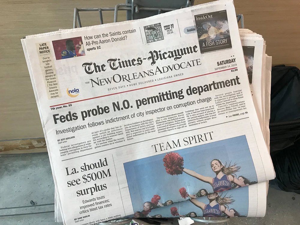
Any time you design a piece, you’ll use a hierarchy of fonts—from large to small—to tell the viewer where to look first.
Grab any newspaper and you’ll see a huge headline up front, then the fonts get smaller with stories of lesser importance, such as this example from the Times Picayune:
You’ll also see the same structure on any website, for example, rollingstone.com:
Here’s the typical font hierarchy you’ll use:
A Headline in a large, distinctive, or bold font
A Sub-headline in the same or secondary font, but always smaller than the headline.
Body text, always in a readable font set in a small size (and never fully bold or italic).
Small or supplemental fonts, used for additional information or disclaimers.
Let’s look at this font hierarchy at work in the below infographic. Note how the eye is led from the larger fonts to the smaller fonts in order of informational importance.
Now look at the pieces below, and observe what your eye is drawn to. I’ll bet you noticed the largest font first.
Give this font hierarchy a try in your next design. I guarantee it will make your pieces shine.
About Jon Hébert
I’m a former newspaper editor, radio DJ, art director, and rock n’ roll front man who ventured into graphic design as a hobby. After receiving my art and design degree from LSU, I worked at several marketing firms before opening Jon Hébert Creative in 2003. I’ve since helped hundreds of clients with their graphic design, digital strategy, storytelling, and more. I’m also a musician and writer.
Created without the use of AI.


