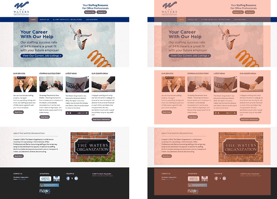
Your website homepage
Have you ever looked at your website homepage and thought, this can be better, but I don’t know how to improve it.
Or, have you ever run across an exceptional website and wondered, how did they design that?
Today we’ll take a look at how to optimize your homepage for the best user experience.
From print to screen
Just as newspapers have evolved to have a consistent format (masthead on top, headline and main story following, then articles listed in order of lesser importance), the modern website homepage functions in essentially the same way.
For example, going from top to bottom on the above website design, with sections highlighted in pink, we have our header with logo, navigation, and tagline. Then we have our ‘hero’ image section with the main call to action (the important next step you want visitors to take on your website).
Next is a services section, followed by an about section, then the footer. Think of websites as having a scrolling hierarchy: the deeper you scroll, the less important information you come across.
(Here’s an additional tip: People visiting your website on a phone would rather scroll than click. Keep that in mind, and always reduce the number of clicks needed to access your most vital information. More than two clicks, and you can consider that information forever lost and unread.)
Keep it above the fold
You may have heard the term “above the fold,” which is a holdover term from newspaper days, when publishers made sure not to bury a headline when the paper was folded.
On your website, “above the fold” means the totality of information your screen can display when a site is first opened.
Always consider what information you want presented above the fold. In this case, I wanted users to view current job openings and to access the main navigation, so I placed this information above the fold, as noted by the pink dotted line.
Using these tips, you’ll ensure that visitors coming to your site won’t miss the most important information you wish to impart. And now, you know exactly how to improve your own homepage, and you know the approach others made to make their pages look so good.
*The images you see were taken from my Graphic Design Essentials online workshop. If you are interested in taking the class, or know anyone who is interested, I send out notifications for upcoming classes through my newsletter (available for signup here).
About Jon Hébert
I’m a former newspaper editor, radio DJ, art director, and rock n’ roll front man who ventured into graphic design as a hobby. After receiving my art and design degree from LSU, I worked at several marketing firms before opening Jon Hébert Creative in 2003. I’ve since helped hundreds of clients with their graphic design, digital strategy, storytelling, and more. I’m also a musician and writer.
Created without the use of AI.


